CONCEPT · UI STUDY
Horology Heritage
Jump to designsAn editorial storefront for discovering antique pocket watches.
01 / THE CONTEXT
A place to begin.
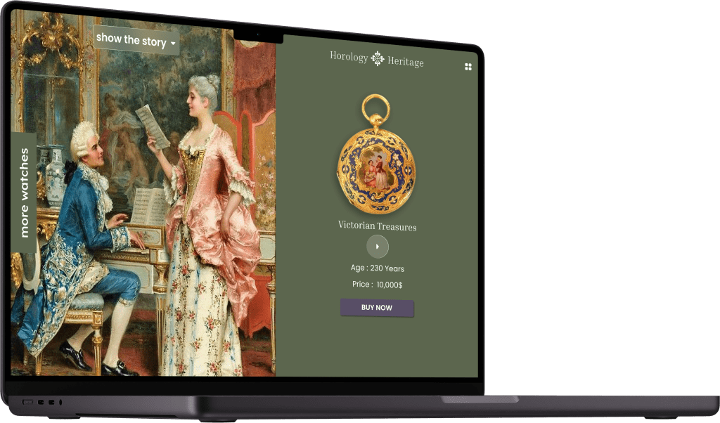
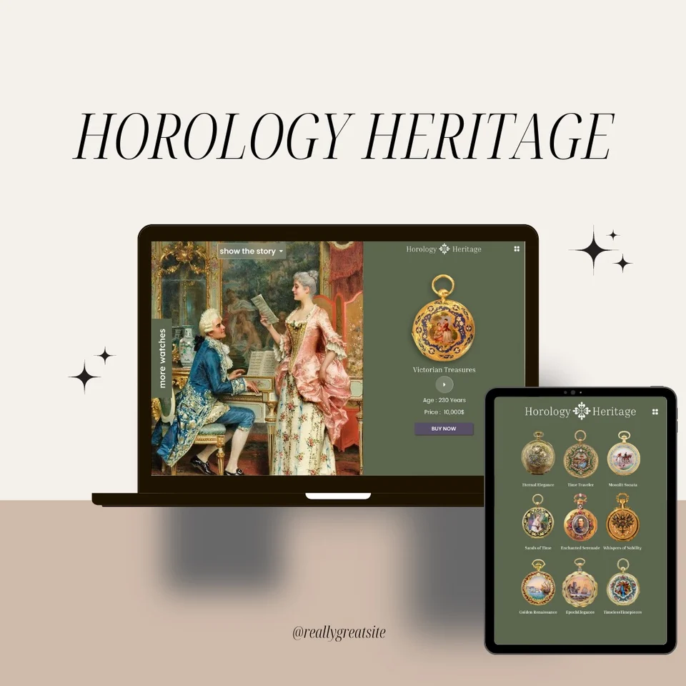
Horology Heritage explores a digital catalogue for antique pocket watches. Historical artwork, olive-green surfaces and serif typography connect the product presentation to the watches’ period character.
02 / VISUAL DIRECTION
A product with a story
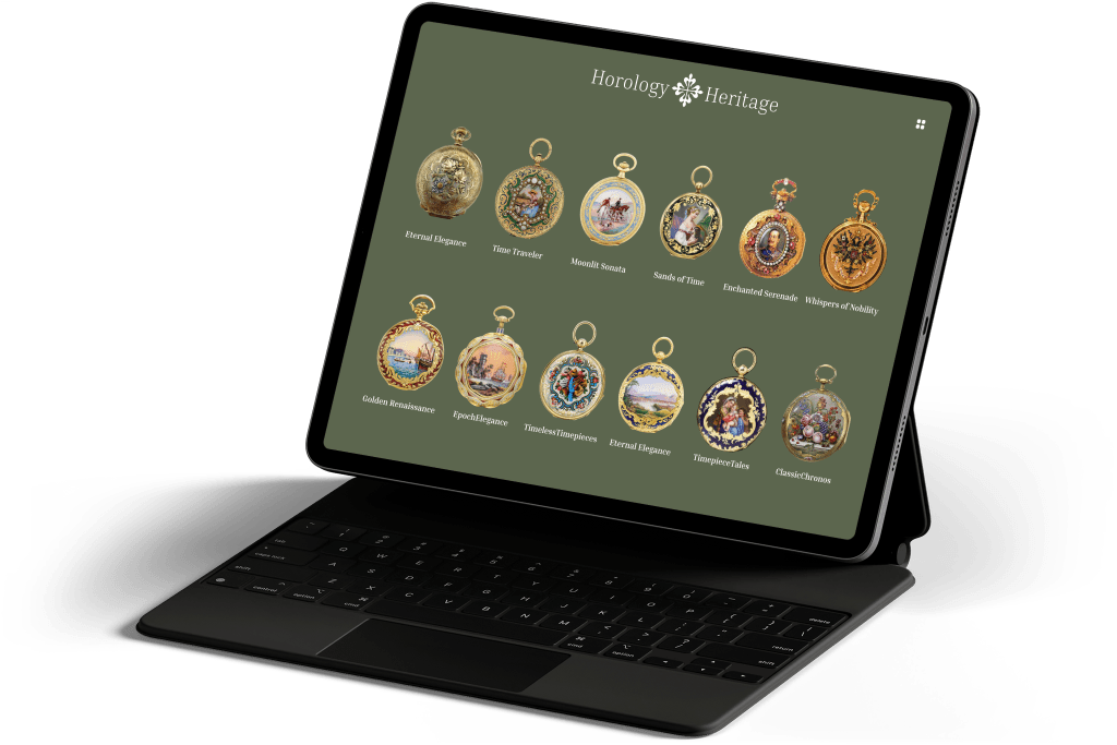
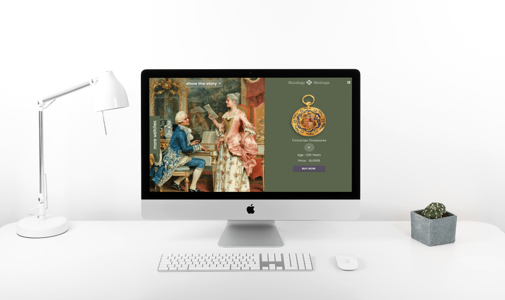
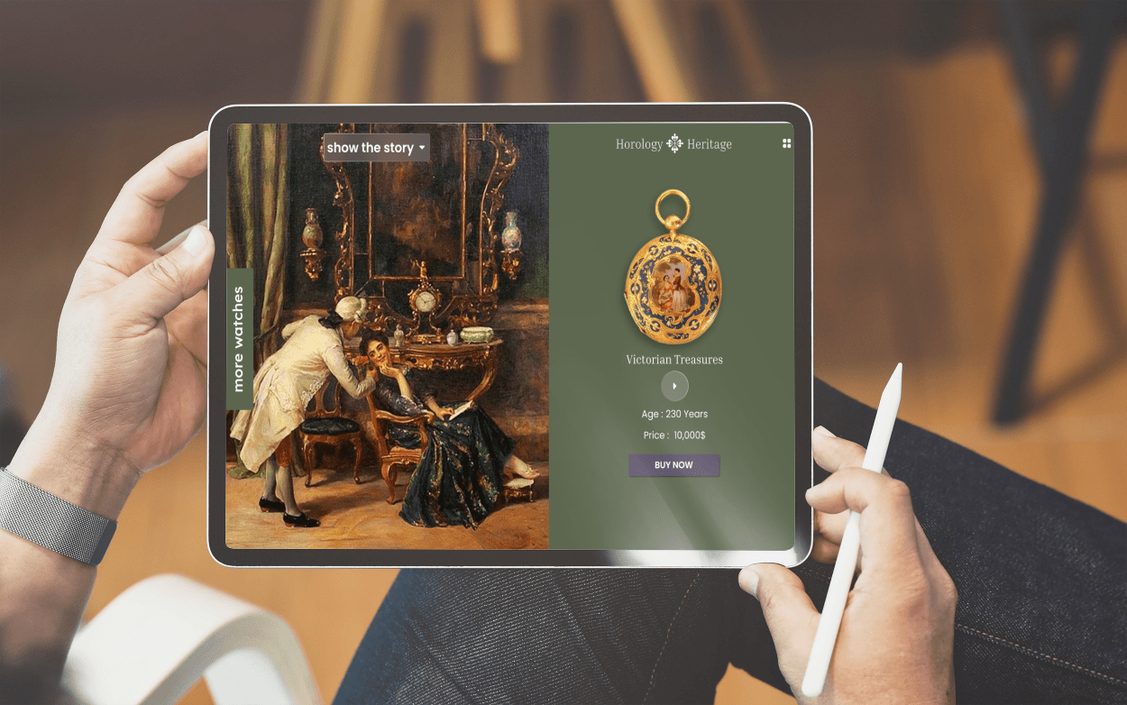
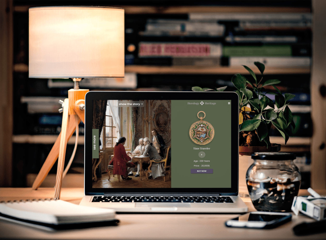
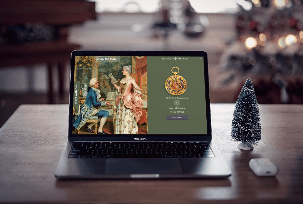
The main screen splits historical imagery and a featured watch into two clear areas. A companion catalogue view presents several watches together, while the featured view uses a compact group of product details and a purchase action.
THE FINAL INTERFACE
Up close, in detail.
Select any screen to enlarge it.
Original interface language is preserved.